")


You want to know my reaction when it comes to using social media to grow my small business?
“FAWWWWKKKK AARON.”

Kaylor’s face right here really does describe my love/hate relationship with social media. Though it can be such an amazing tool for your business, allowing you to connect with people that you may never come across in the real world, it can also be DRAINING, FRUSTRATING and just fucking ANNOYING.
Kind of like Kaylor’s crying spells on Love Island USA this season (I love you Kaylor, no shade girl.)
This is the reason why I’m so passionate about helping business owners leverage their website.
If done right, your website can do so much heavy lifting in your business, which can free up your time and allow you to not feel the need to be glued to your Instagram 24/7. Instead, you can rest easy knowing your website is working in the background like a well-oiled machine. But here’s the thing – your website needs to be optimized for conversions. Because if it’s not, its just taking up space on the interwebs.
So today, I’ve got 5 JUICY TIPS to help you make sure your website is optimized and primed for sales so that you can get your ass back to watching Love Island, 90 Day Fiance, or whatever other trashy TV tickles your fancy.
Tip 1: Create a Clear Customer Journey
This has probably got to be THE most important tip, hence why I put it as number one. The best way to sell with your website is to take your website visitors through an intentional customer journey.
What does this mean?
Think of the customer journey as the entire adventure someone has with your brand, starting from when they first hear about you to when they finally make a purchase and beyond. It’s all the steps they go through, like checking out your website, reading your content, signing up for your emails, and buying something. By mapping out this journey, you can help guide them smoothly through each stage, making sure they have a great experience and are more likely to become loyal customers.
Here are some tips and tricks to help you map out the customer journey on your website:
- Map it out: Visualize the journey on paper or use a tool like a flowchart. Start from the first touchpoint and plot out the steps leading to a purchase and beyond.
- Keep it simple: Ensure each step logically follows the previous one. If a step seems out of place, rework it until it feels natural.
- Test it yourself: Go through the journey as if you were a customer. Does everything flow smoothly? Are there any hiccups or confusing points?
- Keep it clean: Use the same fonts, colors, and style across all your pages. This helps create a seamless experience and makes your branding super identifiable with your ideal peeps.
- Consistent messaging: Make sure your tone of voice and key messages are the same throughout. If you’re casual and friendly on one page, don’t switch to super formal on another.
- Easy navigation: Keep your menu and links in the same place on every page so visitors can easily find what they’re looking for. Don’t have a million pages on your website – just the key, core pages will help the flow of your website
Here’s an example of a clear customer journey from one of my clients, Cakepops by Rachel. She is an artisan cakepop maker that came to me wanting to create a new website for her business that would increase local sales of her cakepops. We started her website with a BOLD hero section that explained who she is and what her business is about to immediately capture her website visitors’ attention. When you scroll down, the first section speaks directly to what she wants her website visitors to do which is buy her cakepops. From there, we introduce Rachel herself and a bit of who she is to help visitors feel more connected to her. Continuing down, we answer the question, “but why should I buy YOUR cakepops, Rachel?” We give 3 big statements about what sets her cakepops apart. After this, we have a section about her cakepop course called School of Cakepop – since the goal of this website is to drive sales of her cakepops (and not necessarily fill up her course) we have this positioned lower down on the home page. We then added in an email opt-in so that she can grow her email list – an ESSENTIAL aspect of any good website. Finally, we have her Instagram feed where people can continue to build a relationship and connect with her after they leave her website. We don’t want this too far up because we want people to stay on her website and not head over to her Instagram, but it’s still good to have this on your website as an additional place for people to get to know you.
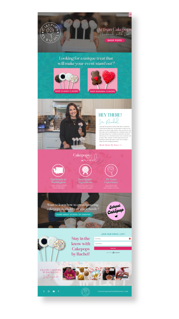
You see what I mean by mapping out a customer journey? When you’re intentional about how you layout your website, it can really help you see more people buying because they are going through the steps, building trust, learning about you and your products and ultimately, will be ready to buy.
Tip 2: Make Sure You Have Clear and Compelling Calls-to-Action (CTAs)
Your calls-to-action, or CTAs, can have a BIG impact on your website. Those little buttons and links are meant to guide your visitors to take action. Think of them like signposts on a road trip. Without clear, compelling CTAs, your visitors might get lost or just not know what to do next. You want them to book that call, sign up for your newsletter, or buy your offer, right? So, make it easy for them, sis! Use bold, direct language and place your CTAs where they can’t be missed. When your visitors know exactly what to do, they’re more likely to take action, which means more conversions for you and more time to enjoy the things you love. Like watching Kaylor cry for the 15th time. Ok ok, I’ll stop knocking my girl Kay, it’s not her fault Aaron is an asshole. Anyways, trust me when I say, a good CTA can make all the difference!
Here are some of my top tips on how to make sure you are MAXIMIZING your CTAs on your website:
- Use strong, action-oriented language:
Be Direct: Use verbs that encourage action like “Buy Now,” “Sign Up,” “Get Started,” or “Learn More.”
Keep It Simple: Avoid jargon or complicated language. The clearer and more straightforward, the better. - Make it STAND OUT:
Contrast Colors: Use a button color that stands out from the rest of your page. I actually like to choose one of my boldest brand colors and ONLY use that color for my CTA buttons to help them really stand out
Size Matters: Ensure your CTA button is large enough to notice but not overwhelming. It should be prominent without overshadowing your content. - Position them strategically:
Above the Fold: Place important CTAs where they can be seen without scrolling in the top part of your website. This is known as “above the fold.” MAKE SURE you have a CTA here no matter what.
Throughout the Page: Don’t be shy about repeating your CTA. Place it at the top, middle, and bottom of your page to catch visitors wherever they might decide to take action. - Create a sense of urgency:
Time-Sensitive Language: Phrases like “Limited Time Offer,” “Act Now,” or “Only a Few Left” can prompt your peeps to act quickly.
Exclusive Deals: Offering special deals or bonuses for immediate action can increase the likelihood of conversion. - Create a smooth follow-through:
Consistent Messaging: Ensure the next page or action matches the promise of the CTA. If your CTA says “Get Your Free Ebook,” make sure the following page delivers exactly that.
Minimal Steps: Reduce the number of steps required after clicking the CTA. The fewer barriers, the higher the conversion rate.
Tip 3: Optimize for Mobile Users
Listen friend, at the time of me writing out this post, it is summer of 2024. Believe it or not, a lot of fucking people look at websites on their phones. Shocking, right?! Not really…we as a society are glued to our damn phones. Which means that your website HAS to be optimized so it looks great on desktop AND mobile. In fact, statistics show that over 60% of website traffic comes from mobile devices.
Don’t look like a dinosaur with a website that looks shitty on smartphones. It’s not a good look, my friend.
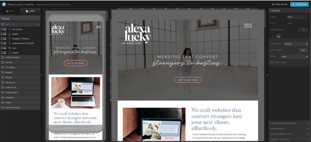
One of the reasons why I love using Showit as my website platform when designing websites for my clients is because you can see your designs in both a mobile version and a desktop version side-by-side. It makes it SO easy to make sure that your website is optimized for mobile and actually looks good on a smartphone. (If you want to give Showit a whirl, I’ve got a special link so you can try it out for a month fo’ free! Here it is, you’re welcome.)
Tip 4: Make Sure your User Experience is TOP notch
Let’s talk a minute about user experience (what the fancy tech people like to call UX). User experience is basically is all about making your website easy and enjoyable for visitors to use. When someone lands on your site, you want them to feel like everything is clear, intuitive, and straightforward. A positive UX keeps visitors engaged, helps them find what they’re looking for quickly, and encourages them to stick around longer. The longer they stay, the more likely they are to take action, whether that’s signing up for your newsletter, booking a call, or purchasing your offer. In other words, great UX boosts your conversions and keeps people coming back for more. THAT’S WHAT WE LIKE AROUND HERE.
Here are a few tips to help make sure your UX is *chef’s kiss*:
- Clear, simple navigation:
Make sure your navigation menu is straightforward with clear labels. Avoid overloading it with too many options—stick to the essentials. - Speed up your site:
Compress your images without losing quality to speed up loading times. Faster sites keep visitors happy and keep people from bouncing off of your site. - Improve readability:
Choose fonts that are easy to read, and use a good size—no one should be squinting to read your content. Also, use headings, bullet points, and short paragraphs to make your content easy to skim. - Engage with visuals:
Incorporate engaging, high-quality images that complement your content and make your site visually appealing. Branding photos will be a literaly GAME CHANGER when it comes to the quality and effectiveness of your website, so if you haven’t already, GET THEM.
Tip 5: Leverage Social Proof
Last, let’s talk about one of the best ways for you to build trust quickly when someone lands on your website: SOCIAL PROOF. Here’s the thing, when someone is brand new to discovering you, they have no clue if you are someone that is worth investing in because they just found you, right? So by making sure you are using social proof such as testimonials and case studies, you are able to start to build that trust and credibility, making someone much more likely to want to buy from you.
A lot of times, I see people either have one section on their entire website that has a carousel of testimonial quotes from their past clients. That’s alright to do – it’s definitely better than nothing. But I think there are MUCH more effective ways to show off that social proof on your website.
Here are some of my tips for utilizing reviews, testimonials and case studies to build trust and credibility with your website visitors:
- Sprinkle your testimonials like fairy dust on ALL your pages: instead of having a whole separate reviews page, or just one section with testimonials on one page, I like to sprinkle testimonials in several places on my clients’ websites. Maybe we have a quote testimonial on the home page, then on the About page we have screenshots from a client sharing a win or transformation from one of your offers, and then on the Services page you have a case study from a client and how you were able to create a result or transformation for them. Having them in multiple places ensures that you are building that trust slowly as they are working their way through your website
- Use all kinds of testimonials: not just quotes from clients: now there is nothing wrong with sharing quotes from happy clients, but again – I like to use multiple forms of social proof such as screenshots from happy clients sharing how stoked they are after getting started with an offer, case studies that go in depth about where they were, what you helped with and then the end result, or portfolios that show before/afters depending on if that’s relevant for your business.
- Show off your expertise: if you are certified in something, have been given a reward or recognition or have certain brands you have worked with, you can show this off on your website for added social proof and credibility
One thing I did on my own website to show some social proof was created a portfolio page where I go DEEP into my web design projects. On my main portfolio page, I have all my projects listed. You can click on a project and it opens up to a new page that starts off with an introduction into the project, sharing more about where my client was when they came to me for help with their website. From there, I show screenshots of branding elements and/or their finished website, and then at the end, I share a quote testimonial from that client as well as a call-to-action to get started (If you want to take a peek, here’s my portfolio for you to look at for some inspo). I love this approach because it’s so much more than a quote from my client – I share what they were feeling before, what we were able to create and then how they felt afterwards. This really helps potential website visitors see the potential of how I am able to help from start to finish.
Need help creating a website that converts? I gotchu…
I hope this post helped give you some good, tangible action items that you can implement on your website. As a quick recap, here are my top 5 tips on how to increase conversions on your website, so you can start using it to sell for you and spend less time hustling on social media:
- Create a clear customer journey: be intentional about your website, what people will see as they scroll and how you can build trust through clear branding, a consistent message, good design and social proof.
- Have clear calls-to-action: make it EASY for people to buy from you with clear call-to-action buttons that stand out with straightforward verbiage, colors that stand out on the page and proper locations in multiple places throughout your website.
- Optimize your website for mobile: do not neglect the mobile design of your website – test it out on different devices to make sure it looks great across the board…not just on your desktop.
- Develop a positive user experience: your website should be clear, consistent, easy to navigate. No clunky, confusing, hard-to-read bullshit happening. No one likes that.
- Use social proof to your advantage: go beyond one carousel of quotes from clients – use screenshots from clients, show off any recognition/certifications, go deep with case studies and have social proof on every page of your website.
If you’re needing some help with creating a website that converts for your business, let me help ya out with this! My Website in a Week package will help you get your website launched in just 7 days. And not just that, but a GOOD website that is branded, beautiful and strategic.
With Website in a Week, you’ll get:
- 5 page website that is beautifully design in Showit: Home, About, Work Together/Offers, Contact & One Long-Form Sales Page
- Branding; Color Palette, Custom Fonts, & Word Mark Logo
- Copy Content Planner & Get Prepped Checklists
- Customized Website Tutorial Videos
- Email Marketing Integration
- Launch Day Graphics and Social Media Posts
I created this offer because I know SO many business owners that say they NEEEEEED to get their website launched, yet it sits at the top of their to do list for months. Instead of putting it off, let’s just get that shit done. Check out Website in a Week if you’re ready to start bringing in more amazing clients into your business with your website!
So I’m curious to know, which of these tips did you find the MOST helpful when it comes to optimizing your website for more conversions? Share in the comments!
Be sure to head over to alexaluckycreative.com if you’re done putting it off and ready to launch your website today. And let’s hang over on socials – I’m @alexaluckycreative everywhere!


 (1)")


View comments
+ Leave a comment